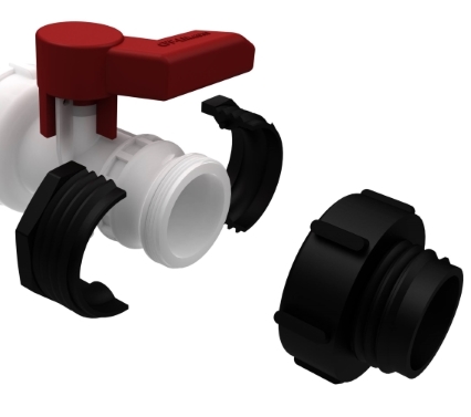

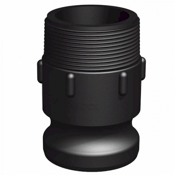
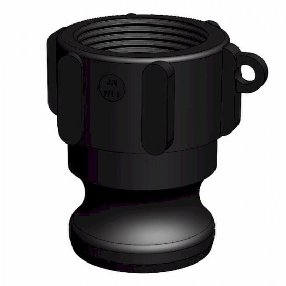
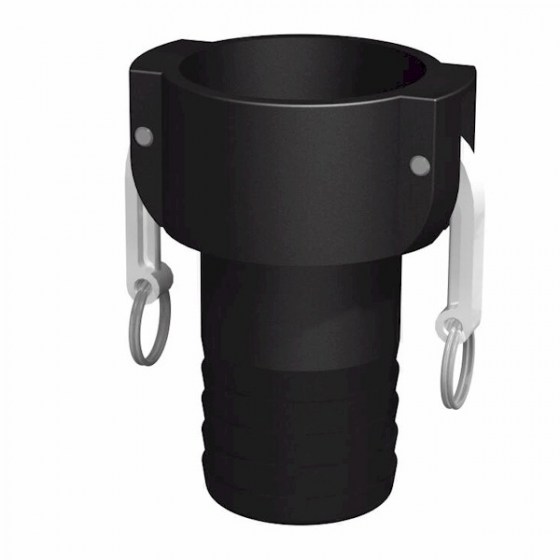
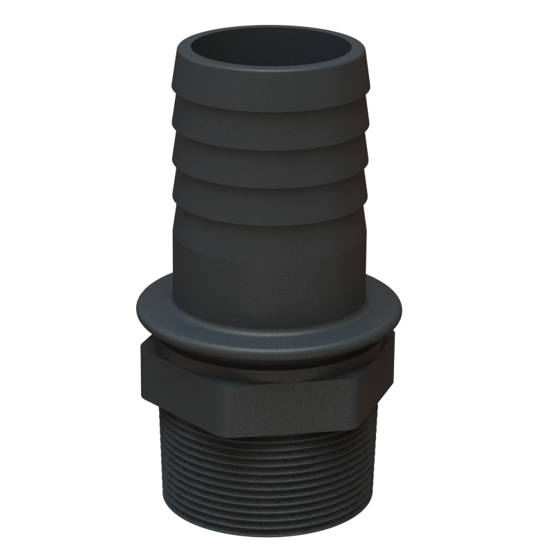
New online shop open at CPP.PARTS
- Details
- Written by Web Master
- Category: Sample Data-Articles
- Hits: 88120

Predict & Follow My Parcel
DPD Local is the most innovative parcel carrier around. Thanks to our industry-leading Predict service, we provide parcel recipients with a one hour delivery window, notified by SMS and email, so they don't have to wait in all day.
What's more, it enables receivers to watch the progress of their delivery on a real-time map, all the way down to a final 15 minute timeslot. Watch our short film below.
Personal Service
To give our SMS and email notifications that personal touch, the sender's branding is included and we even tell your customers the name of the DPD Local driver, as well as the position in their delivery queue
In-flight Options
As well as keeping customers informed at every stage of the journey, we believe in maximising choice and convenience. That's why we provide access to a suite of options both on the day of delivery and the night before, allowing customers to take delivery of their goods in a way that suits. If you wish to reschedule, you can:
- Select an alternative delivery date
Opt for delivery to a nominated neighbour
Have the parcel left in a specified safe place
Collect the parcel from your local DPD Pickup Shop
Upgrade delivery to By 12
- Details
- Written by Sales Order
- Category: Sample Data-Articles
- Hits: 2852
The template comming with built-in parallax script for background images. You can use parallax for backgrounds of whole sections which handling the modules positions. These backgrounds and parallax options can be managed in the template settings area. Also, the template comming with the custom module style which allows to use a parallax for module background.
An example of section parallax background can be seen above and here is an example of module with parallax background:
- Details
- Written by Sales Order
- Category: Sample Data-Articles
- Hits: 3353
Headings
All HTML headings, <h1> through <h6> are available.
Heading 1
Heading 2
Heading 3
Heading 4
Heading 5
Heading 6
Body copy
Bootstrap’s global default font-size is 13px, with a line-height of 19px. However you can set up your own font size value in the template settings area. This is applied to the <body> and all paragraphs. In addition, <p> (paragraphs) receive a bottom margin.
Nullam quis risus eget urna mollis ornare vel eu leo. Cum sociis natoque penatibus et magnis dis parturient montes, nascetur ridiculus mus. Nullam id dolor id nibh ultricies vehicula.
Cum sociis natoque penatibus et magnis dis parturient montes, nascetur ridiculus mus. Donec ullamcorper nulla non metus auctor fringilla. Duis mollis, est non commodo luctus, nisi erat porttitor ligula, eget lacinia odio sem nec elit. Donec ullamcorper nulla non metus auctor fringilla.
Maecenas sed diam eget risus varius blandit sit amet non magna. Donec id elit non mi porta gravida at eget metus. Duis mollis, est non commodo luctus, nisi erat porttitor ligula, eget lacinia odio sem nec elit.
<p>...</p>
Lead body copy
Make a paragraph stand out by adding .lead.
Vivamus sagittis lacus vel augue laoreet rutrum faucibus dolor auctor. Duis mollis, est non commodo luctus.
<p class="lead">...</p>
Emphasis
Make use of HTML’s default emphasis tags with lightweight styles.
<small>
For de-emphasizing inline or blocks of text, use the small tag.
This line of text is meant to be treated as fine print.
<p>
  <small>This line of text is meant to be treated as fine print.</small>
</p>
Bold
For emphasizing a snippet of text with a heavier font-weight.
The following snippet of text is rendered as bold text.
<strong>rendered as bold text</strong>
Italics
For emphasizing a snippet of text with italics.
The following snippet of text is rendered as italicized text.
<em>rendered as italicized text</em>
Heads up! Feel free to use <b> and <i> in HTML5. <b> is meant to highlight words or phrases without conveying additional importance while <i> is mostly for voice, technical terms, etc.
Abbreviations
Stylized implemenation of HTML’s <abbr> element for abbreviations and acronyms to show the expanded version on hover. Abbreviations with a title attribute have a light dotted bottom border and a help cursor on hover, providing additional context on hover.
<abbr>
For expanded text on long hover of an abbreviation, include the title attribute.
An abbreviation of the word attribute is attr.
<abbr title="attribute">attr</abbr>
<abbr class="initialism">
Add .initialism to an abbreviation for a slightly smaller font-size.
HTML is the best thing since sliced bread.
<abbr title="HyperText Markup Language" class="initialism">HTML</abbr>
Addresses
Present contact information for the nearest ancestor or the entire body of work.
<address>
Preserve formatting by ending all lines with <br>.
123 Some Nice Ave, Suite 123
San Francisco, CA 98765
P: (123) 456-7890Full Name
This email address is being protected from spambots. You need JavaScript enabled to view it.
<address>
<strong>Template Developer, Inc.</strong><br>
123 Some Nice Ave, Suite 123<br>
San Francisco, CA 98765<br>
<abbr title="Phone">P:</abbr> (123) 456-7890
</address>
<address>
<strong>Full Name</strong><br>
<a href="mailto:#">This email address is being protected from spambots. You need JavaScript enabled to view it.</a>
</address>
Blockquotes
For quoting blocks of content from another source within your document.
Default blockquote
Wrap <blockquote> around any HTML as the quote. For straight quotes we recommend a <p>.
Lorem ipsum dolor sit amet, consectetur adipiscing elit. Integer posuere erat a ante.
<blockquote>
  <p>Lorem ipsum dolor sit amet, consectetur adipiscing elit. Integer posuere erat a ante.</p>
</blockquote>
Blockquote options
Style and content changes for simple variations on a standard blockquote.
Naming a source
Add <small> tag for identifying the source. Wrap the name of the source work in <cite>.
Lorem ipsum dolor sit amet, consectetur adipiscing elit. Integer posuere erat a ante.
Someone famous in Source Title
<blockquote>
  <p>Lorem ipsum dolor sit amet, consectetur adipiscing elit. Integer posuere erat a ante.</p>
  <small>Someone famous <cite title="Source Title">Source Title</cite></small>
</blockquote>
Alternate displays
Use .pull-right for a floated, right-aligned blockquote.
<blockquote class="pull-right">
  ...
</blockquote>
Lists
Unordered
A list of items in which the order does not explicitly matter.
- Lorem ipsum dolor sit amet
- Consectetur adipiscing elit
- Integer molestie lorem at massa
- Facilisis in pretium nisl aliquet
- Nulla volutpat aliquam velit
- Phasellus iaculis neque
- Purus sodales ultricies
- Vestibulum laoreet porttitor sem
- Ac tristique libero volutpat at
- Faucibus porta lacus fringilla vel
- Aenean sit amet erat nunc
- Eget porttitor lorem
<ul>
  <li>...</li>
</ul>
Ordered
A list of items in which the order does explicitly matter.
- Lorem ipsum dolor sit amet
- Consectetur adipiscing elit
- Integer molestie lorem at massa
- Facilisis in pretium nisl aliquet
- Nulla volutpat aliquam velit
- Faucibus porta lacus fringilla vel
- Aenean sit amet erat nunc
- Eget porttitor lorem
<ol>
  <li>...</li>
</ol>
Unstyled
A list of items with no list-style or additional left padding.
- Lorem ipsum dolor sit amet
- Consectetur adipiscing elit
- Integer molestie lorem at massa
- Facilisis in pretium nisl aliquet
- Nulla volutpat aliquam velit
- Phasellus iaculis neque
- Purus sodales ultricies
- Vestibulum laoreet porttitor sem
- Ac tristique libero volutpat at
- Faucibus porta lacus fringilla vel
- Aenean sit amet erat nunc
- Eget porttitor lorem
<ul class="unstyled">
  <li>...</li>
</ul>
Description
A list of terms with their associated descriptions.
- Description lists
- A description list is perfect for defining terms.
- Euismod
- Vestibulum id ligula porta felis euismod semper eget lacinia odio sem nec elit.
- Donec id elit non mi porta gravida at eget metus.
- Malesuada porta
- Etiam porta sem malesuada magna mollis euismod.
<dl>
  <dt>...</dt>
  <dd>...</dd>
</dl>
Horizontal description
Make terms and descriptions in <dl> line up side-by-side.
- Description lists
- A description list is perfect for defining terms.
- Euismod
- Vestibulum id ligula porta felis euismod semper eget lacinia odio sem nec elit.
- Donec id elit non mi porta gravida at eget metus.
- Malesuada porta
- Etiam porta sem malesuada magna mollis euismod.
- Felis euismod semper eget lacinia
- Fusce dapibus, tellus ac cursus commodo, tortor mauris condimentum nibh, ut fermentum massa justo sit amet risus.
<dl class="dl-horizontal">
  <dt>...</dt>
  <dd>...</dd>
</dl>
Heads up!
Horizontal description lists will truncate terms that are too long to fit in the left column fix text-overflow. In narrower viewports, they will change to the default stacked layout.
Code
Inline
Wrap inline snippets of code with <code>.
<section> should be wrapped as inline.For example, <code><section></code> should be wrapped as inline.
Basic block
Use <pre> for multiple lines of code. Be sure to escape any angle brackets in the code for proper rendering.
<p>Sample text here...</p>
<pre> <p>Sample text here...</p> </pre>
Heads up! Be sure to keep code within <pre> tags as close to the left as possible; it will render all tabs.
You may optionally add the .pre-scrollable class which will set a max-height of 350px and provide a y-axis scrollbar.
Images
Add classes to an <img> element to easily style images in any project.
<img src="/..." class="img-rounded">
<img src="/..." class="img-circle">
<img src="/..." class="img-polaroid">
Heads up! .img-rounded and .img-circle do not work in IE7-8 due to lack of border-radius support.
- Details
- Written by Sales Order
- Category: Sample Data-Articles
- Hits: 4818
The template comming with huge selection of icons you can easy use in your content. Thanks to the FontAwesome icons support you can rich your text to make it more outstanding and attractive for your visitors.
Available Icons
- New icons
- Web Application Icons
- Accessibility Icons
- Hand Icons
- Transportation Icons
- Gender Icons
- File Type Icons
- Spinner Icons
- Form Control Icons
- Payment Icons
- Chart Icons
- Currency Icons
- Text Editor Icons
- Directional Icons
- Video Player Icons
- Brand Icons
- Medical Icons
- Stroke Icons 7
How to use icons
New Icons
Web Application Icons
Accessibility Icons
Hand Icons
Transportation Icons
Gender Icons
File Type Icons
Spinner Icons
Form Control Icons
Payment Icons
Chart Icons
Currency Icons
Text Editor Icons
Directional Icons
Video Player Icons
Brand Icons
Medical Icons
Stroke Icons 7
pe-7s-album
pe-7s-arc
pe-7s-back-2
pe-7s-bandaid
pe-7s-car
pe-7s-diamond
pe-7s-door-lock
pe-7s-eyedropper
pe-7s-female
pe-7s-gym
pe-7s-hammer
pe-7s-headphones
pe-7s-helm
pe-7s-hourglass
pe-7s-leaf
pe-7s-magic-wand
pe-7s-male
pe-7s-map-2
pe-7s-next-2
pe-7s-paint-bucket
pe-7s-pendrive
pe-7s-photo
pe-7s-piggy
pe-7s-plugin
pe-7s-refresh-2
pe-7s-rocket
pe-7s-settings
pe-7s-shield
pe-7s-smile
pe-7s-usb
pe-7s-vector
pe-7s-wine
pe-7s-cloud-upload
pe-7s-cash
pe-7s-close
pe-7s-bluetooth
pe-7s-cloud-download
pe-7s-way
pe-7s-close-circle
pe-7s-id
pe-7s-angle-up
pe-7s-wristwatch
pe-7s-angle-up-circle
pe-7s-world
pe-7s-angle-right
pe-7s-volume
pe-7s-angle-right-circle
pe-7s-users
pe-7s-angle-left
pe-7s-user-female
pe-7s-angle-left-circle
pe-7s-up-arrow
pe-7s-angle-down
pe-7s-switch
pe-7s-angle-down-circle
pe-7s-scissors
pe-7s-wallet
pe-7s-safe
pe-7s-volume2
pe-7s-volume1
pe-7s-voicemail
pe-7s-video
pe-7s-user
pe-7s-upload
pe-7s-unlock
pe-7s-umbrella
pe-7s-trash
pe-7s-tools
pe-7s-timer
pe-7s-ticket
pe-7s-target
pe-7s-sun
pe-7s-study
pe-7s-stopwatch
pe-7s-star
pe-7s-speaker
pe-7s-signal
pe-7s-shuffle
pe-7s-shopbag
pe-7s-share
pe-7s-server
pe-7s-search
pe-7s-film
pe-7s-science
pe-7s-disk
pe-7s-ribbon
pe-7s-repeat
pe-7s-refresh
pe-7s-add-user
pe-7s-refresh-cloud
pe-7s-paperclip
pe-7s-radio
pe-7s-note2
pe-7s-print
pe-7s-network
pe-7s-prev
pe-7s-mute
pe-7s-power
pe-7s-medal
pe-7s-portfolio
pe-7s-like2
pe-7s-plus
pe-7s-left-arrow
pe-7s-play
pe-7s-key
pe-7s-plane
pe-7s-joy
pe-7s-photo-gallery
pe-7s-pin
pe-7s-phone
pe-7s-plug
pe-7s-pen
pe-7s-right-arrow
pe-7s-paper-plane
pe-7s-delete-user
pe-7s-paint
pe-7s-bottom-arrow
pe-7s-notebook
pe-7s-note
pe-7s-next
pe-7s-news-paper
pe-7s-musiclist
pe-7s-music
pe-7s-mouse
pe-7s-more
pe-7s-moon
pe-7s-monitor
pe-7s-micro
pe-7s-menu
pe-7s-map
pe-7s-map-marker
pe-7s-mail
pe-7s-mail-open
pe-7s-mail-open-file
pe-7s-magnet
pe-7s-loop
pe-7s-look
pe-7s-lock
pe-7s-lintern
pe-7s-link
pe-7s-like
pe-7s-light
pe-7s-less
pe-7s-keypad
pe-7s-junk
pe-7s-info
pe-7s-home
pe-7s-help2
pe-7s-help1
pe-7s-graph3
pe-7s-graph2
pe-7s-graph1
pe-7s-graph
pe-7s-global
pe-7s-gleam
pe-7s-glasses
pe-7s-gift
pe-7s-folder
pe-7s-flag
pe-7s-filter
pe-7s-file
pe-7s-expand1
pe-7s-exapnd2
pe-7s-edit
pe-7s-drop
pe-7s-drawer
pe-7s-download
pe-7s-display2
pe-7s-display1
pe-7s-diskette
pe-7s-date
pe-7s-cup
pe-7s-culture
pe-7s-crop
pe-7s-credit
pe-7s-copy-file
pe-7s-config
pe-7s-compass
pe-7s-comment
pe-7s-coffee
pe-7s-cloud
pe-7s-clock
pe-7s-check
pe-7s-chat
pe-7s-cart
pe-7s-camera
pe-7s-call
pe-7s-calculator
pe-7s-browser
pe-7s-box2
pe-7s-box1
pe-7s-bookmarks
pe-7s-bicycle
pe-7s-bell
pe-7s-battery
pe-7s-ball
pe-7s-back
pe-7s-attention
pe-7s-anchor
pe-7s-albums
pe-7s-alarm
pe-7s-airplay
How To Use Icons
Here you can find all informations necessary to allow you to put an icons into your content. To find out more about FontAwesome visit http://fontawesome.io/.
Basic Usage
Example: basic icon fa-camera-retro
You can place Font Awesome icons just about anywhere using the CSS Prefix fa and the icon's name. Font Awesome is designed to be used with inline elements (we like the <i> tag for brevity, but using a <span> is more semantically correct).
<i class="fa fa-camera-retro"></i> fa-camera-retro
Note: TinyMCE by default removes an empty tags so, when you put an icon code and save your icon will be removed. To prevent it go to Extensions Plugins and open Editor - TinyMCE. Find Extended Valid Elements field and type i[*] and click Save.
Larger Icons
fa-lg
fa-2x
fa-3x
fa-4x
fa-5x
To increase icon sizes relative to their container, use the fa-lg (33% increase), fa-2x, fa-3x, fa-4x, or fa-5x classes.
<i class="fa fa-camera-retro fa-lg"></i> fa-lg
<i class="fa fa-camera-retro fa-2x"></i> fa-2x
<i class="fa fa-camera-retro fa-3x"></i> fa-3x
<i class="fa fa-camera-retro fa-4x"></i> fa-4x
<i class="fa fa-camera-retro fa-5x"></i> fa-5x
Fixed Width Icons
Use fa-fw to set icons at a fixed width. Great to use when different icon widths throw off alignment. Especially useful in things like nav lists & list groups.
<a class= href="#"><i class="fa fa-home fa-fw" aria-hidden="true"></i> Home</a>
Animated Icons
Loading example (with fa-spinner icon) Loading (with fa-circle-o-notch icon) Loading example (with fa-refresh icon) Loading example (with fa-cog icon) Loading example (with fa-spinner icon)
Use the fa-spin class to get any icon to rotate, and use fa-pulse to have it rotate with 8 steps. Works well with fa-spinner, fa-refresh, and fa-cog.
<i class="fa fa-spinner fa-spin fa-3x fa-fw"></i>
<span class="sr-only">Loading...</span>

<i class="fa fa-circle-o-notch fa-spin fa-3x fa-fw"></i>
<span class="sr-only">Loading...</span>

<i class="fa fa-refresh fa-spin fa-3x fa-fw"></i>
<span class="sr-only">Loading...</span>

<i class="fa fa-cog fa-spin fa-3x fa-fw"></i>
<span class="sr-only">Loading...</span>

<i class="fa fa-spinner fa-pulse fa-3x fa-fw"></i>
<span class="sr-only">Loading...</span>
Note: CSS3 animations aren't supported in IE8 - IE9.
Rotated & Flipped
normal
fa-rotate-90
fa-rotate-180
fa-rotate-270
fa-flip-horizontal
fa-flip-vertical
To arbitrarily rotate and flip icons, use the fa-rotate-* and fa-flip-* classes.
<i class="fa fa-shield"></i> normal<br>
<i class="fa fa-shield fa-rotate-90"></i> fa-rotate-90<br>
<i class="fa fa-shield fa-rotate-180"></i> fa-rotate-180<br>
<i class="fa fa-shield fa-rotate-270"></i> fa-rotate-270<br>
<i class="fa fa-shield fa-flip-horizontal"></i> fa-flip-horizontal<br>
<i class="fa fa-shield fa-flip-vertical"></i> fa-flip-vertical
- Details
- Written by Sales Order
- Category: Sample Data-Articles
- Hits: 3125
The template provides following built-in styles which you can use to make your content more outstanding.
Modules with simple styling
Default Module
Lorem ipsum dolor sit amet, consectetur adipiscing elit, sed do eiusmod tempor incididunt ut labore et dolore magna aliqua. Ut enim ad minim veniam, quis nostrud exercitation ullamco laboris nisi ut aliquip ex ea commodo consequat.
Text Module
Lorem ipsum dolor sit amet, consectetur adipiscing elit, sed do eiusmod tempor incididunt ut labore et dolore magna aliqua.
Module Class Suffix _text
Lorem ipsum dolor sit amet, consectetur adipiscing elit, sed do eiusmod tempor incididunt ut labore et dolore magna aliqua.
Module Class Suffix _style1
Module Style 2
Lorem ipsum dolor sit amet, consectetur adipiscing elit, sed do eiusmod tempor incididunt ut labore et dolore magna aliqua.
Module Class Suffix _style2
Modules Style 3
Module Style 3 Color 1
Lorem ipsum dolor sit amet, consectetur adipiscing elit, sed do eiusmod tempor incididunt ut labore et dolore magna aliqua.
Module Class Suffix _style3 color1
Module Style 3 Color 2
Lorem ipsum dolor sit amet, consectetur adipiscing elit, sed do eiusmod tempor incididunt ut labore et dolore magna aliqua.
Module Class Suffix _style3 color2
Module Style 3 Color 3
Lorem ipsum dolor sit amet, consectetur adipiscing elit, sed do eiusmod tempor incididunt ut labore et dolore magna aliqua.
Module Class Suffix _style3 color3
Modules Style 3 with shadow
Module Style 3 Color 1
Lorem ipsum dolor sit amet, consectetur adipiscing elit, sed do eiusmod tempor incididunt ut labore et dolore magna aliqua.
Module Class Suffix _style3 color1 shadow
Module Style 3 Color 2
Lorem ipsum dolor sit amet, consectetur adipiscing elit, sed do eiusmod tempor incididunt ut labore et dolore magna aliqua.
Module Class Suffix _style3 color2 shadow
Module Style 3 Color 3
Lorem ipsum dolor sit amet, consectetur adipiscing elit, sed do eiusmod tempor incididunt ut labore et dolore magna aliqua.
Module Class Suffix _style3 color3 shadow
Modules Style 3 with rounded corners
Module Style 3 Color 1
Lorem ipsum dolor sit amet, consectetur adipiscing elit, sed do eiusmod tempor incididunt ut labore et dolore magna aliqua.
Module Class Suffix _style3 color1 shadow radius
Module Style 3 Color 2
Lorem ipsum dolor sit amet, consectetur adipiscing elit, sed do eiusmod tempor incididunt ut labore et dolore magna aliqua.
Module Class Suffix _style3 color2 shadow radius
Module Style 3 Color 3
Lorem ipsum dolor sit amet, consectetur adipiscing elit, sed do eiusmod tempor incididunt ut labore et dolore magna aliqua.
Module Class Suffix _style3 color3 shadow radius
Modules with scroll reveal
Scroll Reveal 1
Lorem ipsum dolor sit amet, consectetur adipiscing elit, sed do eiusmod tempor incididunt ut labore et dolore magna aliqua.
Module Class Suffix moveup
This sample use following module class suffix: _style3 color3 shadow radius moveup
Scroll Reveal 2
Lorem ipsum dolor sit amet, consectetur adipiscing elit, sed do eiusmod tempor incididunt ut labore et dolore magna aliqua.
Module Class Suffix movedown
This sample use following module class suffix: _style3 color2 shadow radius moveup
Scroll Reveal 3
Lorem ipsum dolor sit amet, consectetur adipiscing elit, sed do eiusmod tempor incididunt ut labore et dolore magna aliqua.
Module Class Suffix moveleft
This sample use following module class suffix: _style3 color2 shadow radius moveup
Scroll Reveal 4
Lorem ipsum dolor sit amet, consectetur adipiscing elit, sed do eiusmod tempor incididunt ut labore et dolore magna aliqua.
Module Class Suffix moveright
This sample use following module class suffix: _style3 color3 shadow radius moveup
Modules Style 4
Module Style 4
Lorem ipsum dolor sit amet, consectetur adipiscing elit, sed do eiusmod tempor incididunt ut labore et dolore magna aliqua.
Module Class Suffix _style4 color1
Module Style 4 Color 2
Lorem ipsum dolor sit amet, consectetur adipiscing elit, sed do eiusmod tempor incididunt ut labore et dolore magna aliqua.
Module Class Suffix _style4 color2
Module Style 4 Color 3
Lorem ipsum dolor sit amet, consectetur adipiscing elit, sed do eiusmod tempor incididunt ut labore et dolore magna aliqua.
Module Class Suffix _style4 color3
You can also use following suffixes with modules with style4 applied: color1, color2, color3, moveup, movedown, moveleft, moveright.
To use FontAwesome icons in Style4 module type icon name in Header Class field
Modules Style 5
Module Style 5 Color 1
Module with image

Module Class Suffix _style5 color1 shadow reverse
Module Style 5 Color 2
Module with image

Module Class Suffix _style5 color2
Module Style 5 Color 3
Module with image
Module Class Suffix _style5 color3
Modules Style 6
Module Style 6 Color 1

Module Class Suffix _style6 tes-down color1

Module Style 6 Color 2
Module Class Suffix _style6 tes-up color2
Module Style 6 Color 3

Module Class Suffix _style6 tes-down color3
To display person photo, name and stars above or below use tes-up or tes-down.
To display stars below the person name use one of following classes in Header Class field: stars5, stars4, stars3, stars2, stars1
Custom Module With Simple Parallax Image
Usage
Module Class Suffix: _style7
Module Style: parallax
To align the text vertically use one of following suffixes: text-top, text-middle or text-bottom. By default the text is set on middle.
Subcategories
Joomla!
Extensions
The Joomla! content management system lets you create webpages of various types using extensions. There are 5 basic types of extensions: components, modules, templates, languages, and plugins. Your website includes the extensions you need to create a basic website in English, but thousands of additional extensions of all types are available. The Joomla! Extensions Directory is the largest directory of Joomla extensions.
Components
Components are larger extensions that produce the major content for your site. Each component has one or more "views" that control how content is displayed. In the Joomla administrator there are additional extensions such as Menus, Redirection, and the extension managers.
Modules
Modules are small blocks of content that can be displayed in positions on a web page. The menus on this site are displayed in modules. The core of Joomla! includes 24 separate modules ranging from login to search to random images. Each module has a name that starts mod_ but when it displays it has a title. In the descriptions in this section, the titles are the same as the names.
Content Modules
Content modules display article and other information from the content component.
User Modules
User modules interact with the user system, allowing users to login, show who is logged-in, and showing the most recently registered users.
Display Modules
These modules display information from components other than content and user. These include weblinks, news feeds and the media manager.
Utility Modules
Utility modules provide useful functionality such as search, syndication and statistics.
Navigation Modules
Navigation modules help your visitors move through your site and find what they need.
Menus provide your site with structure and help your visitors navigate your site. Although they are all based on the same menu module, the variety of ways menus are used in the sample data show how flexible this module is.
A menu can range from extremely simple (for example the top menu or the menu for the Australian Parks sample site) to extremely complex (for example the About Joomla! menu with its many levels). They can also be used for other types of presentation such as the site map linked from the "This Site" menu.
Breadcrumbs provide users with information about where they are in a site.
Park Site
Park Blog
Here is where I will blog all about the parks of Australia.
You can make a blog on your website by creating a category to write your blog posts in (this one is called Park Blog). Each blog post will be an article in that category. If you make a category blog menu link with 1 column it will look like this page, if you display the category description then this part is displayed.
To enhance your blog you may want to add extensions for comments, interacting with social network sites, tagging, and keeping in contact with your readers. You can also enable the syndication that is included in Joomla (in the Integration Options set Show Feed Link to Show and make sure to display the syndication module on the page).
Photo Gallery
These are my photos from parks I have visited (I didn't take them, they are all from Wikimedia Commons).
This shows you how to make a simple image gallery using articles in com_content.
In each article put a thumbnail image before a "readmore" and the full size image after it. Set the article to Show Intro Text: Hide.
Fruit Shop Site
Growers
We search the whole countryside for the best fruit growers.
You can let each supplier have a page that he or she can edit. To see this in action you will need to create a user who is in the suppliers group.
Create one page in the growers category for that user and make that supplier the author of the page. That user will be able to edit his or her page.
This illustrates the use of the Edit Own permission.